Never underestimate the importance of good web design.
It can make or break your conversion rate.
And it's not just a matter of aesthetic appeal. It's more about user experience (UX).
If your site is hard to navigate, and it takes too long for visitors to figure out where to go, they're not going to stick around.
CHALLENGE Yourself to Profit!
Free Download: Build Your Profit-Generating Online Business With This Free Blueprint
Sign Up, follow the easy steps and You'll get the tactics, strategies & techniques needed to create your online profit stream. It's free!
A clean interface with intuitive navigation is absolutely essential for an ecommerce site.
Shopify makes it pretty easy to put together a great looking website, but you'll still end up needing to make some design decisions.
Although aesthetics aren't the be-all and end-all, that doesn't mean they aren't important.
Visually appealing designs that reflect a brand's overall ethos can help give your shop an edge.
In a recent blog post, A Better Lemonade Stand highlights some of the most interesting and appealing ecommerce store designs out there.
Here are ten of the best.
1. ALLBIRDS
[image source: A Better Lemonade Stand]
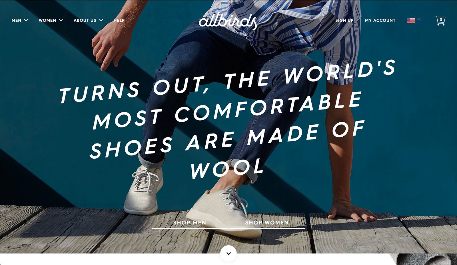
This website has a casual yet sleek feel to it, which is what the brand aims at promoting its products as.
It uses a brilliant mix of gifs, images and illustrations along with videos to showcase the brand’s youthfulness.
The playful vibe speaks to the kind of consumers they’re targeting – adventurous and active ones – and you can’t miss their unique value proposition that’s right in the centre of the page in large, clear font.
2. BEARDBRAND
[image source: A Better Lemonade Stand]
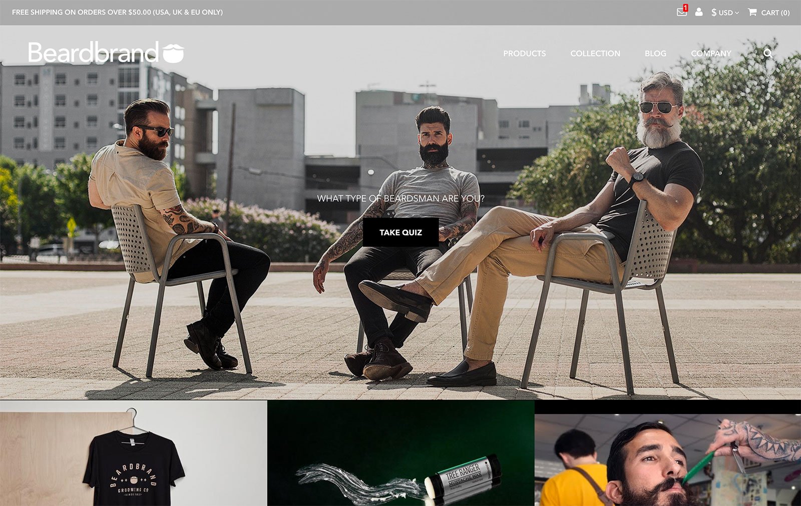
On Beardbrand’s homepage they put a lifestyle shot front and centre to communicate to their customers how their products look in action.
On the focal image they intelligently have placed a call to action, “What type of beardsman are you? Take quiz,” to encourage visitors to interact with their site and ultimately, to encourage them to buy and try some of their products.
Below the main lifestyle shot, but still “above the fold”, they include images of their merchandise, product photos and a snapshot of their tutorials to show visitors what other content their website has to offer.
3. COMMANDER DEER
[image source: A Better Lemonade Stand]
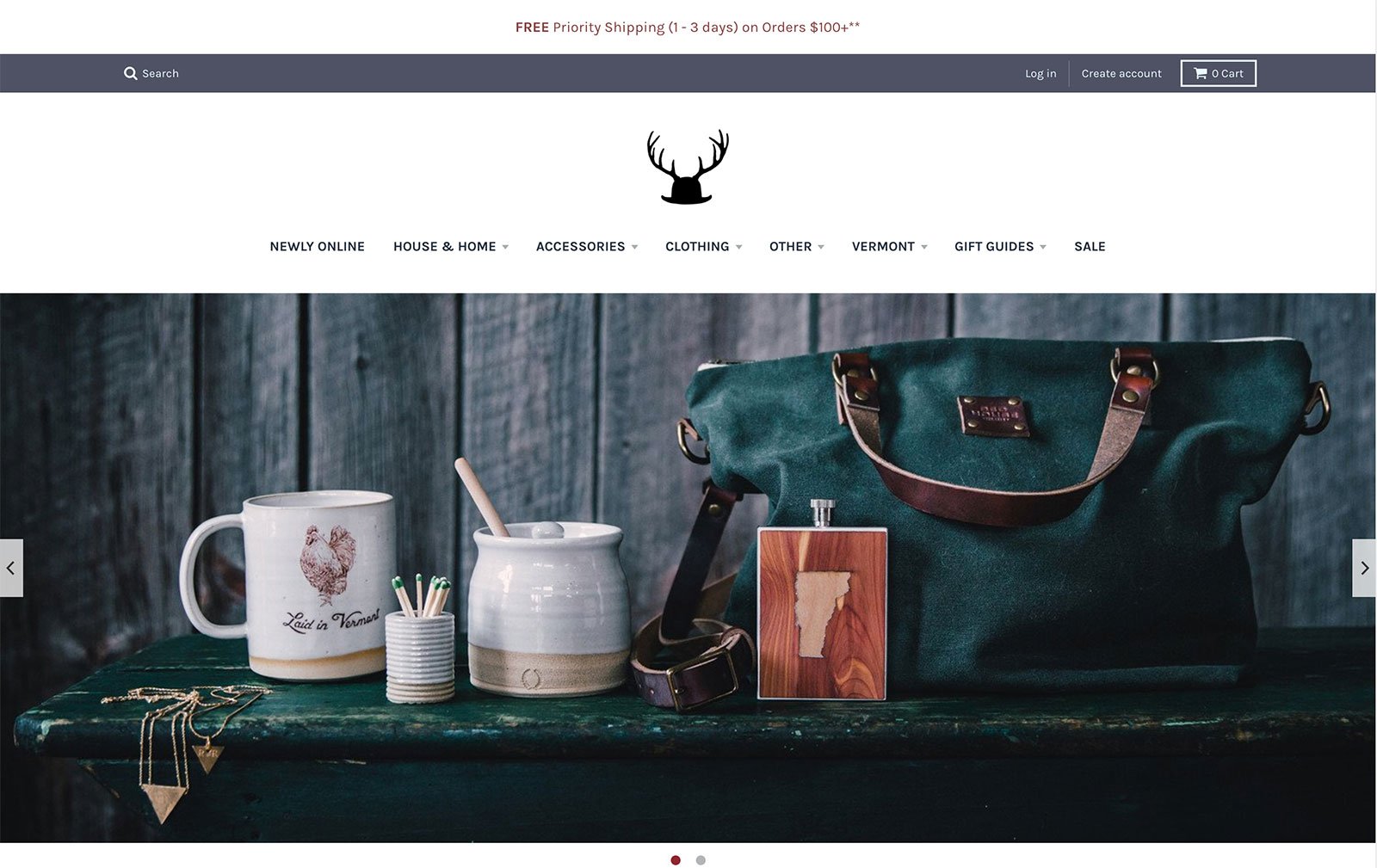
Almost everything – from the logo to the product photography, has a very western-rustic feel to it which plays into the brand’s identity as they produce and sell “American Made Goods”.
They showcase lifestyle shots of the products in action in a rotating image carousel (see those two small dots underneath the image?
Those indicate that there are two images on a slide show that changes every couple of seconds) so customers get to see as much of their product offering as quickly as possible.
Also note how they include information about their shipping right at the top of the page so customer don’t have to dig around their website for it.
4. DEATH WISH COFFEE CO.
[image source: A Better Lemonade Stand]
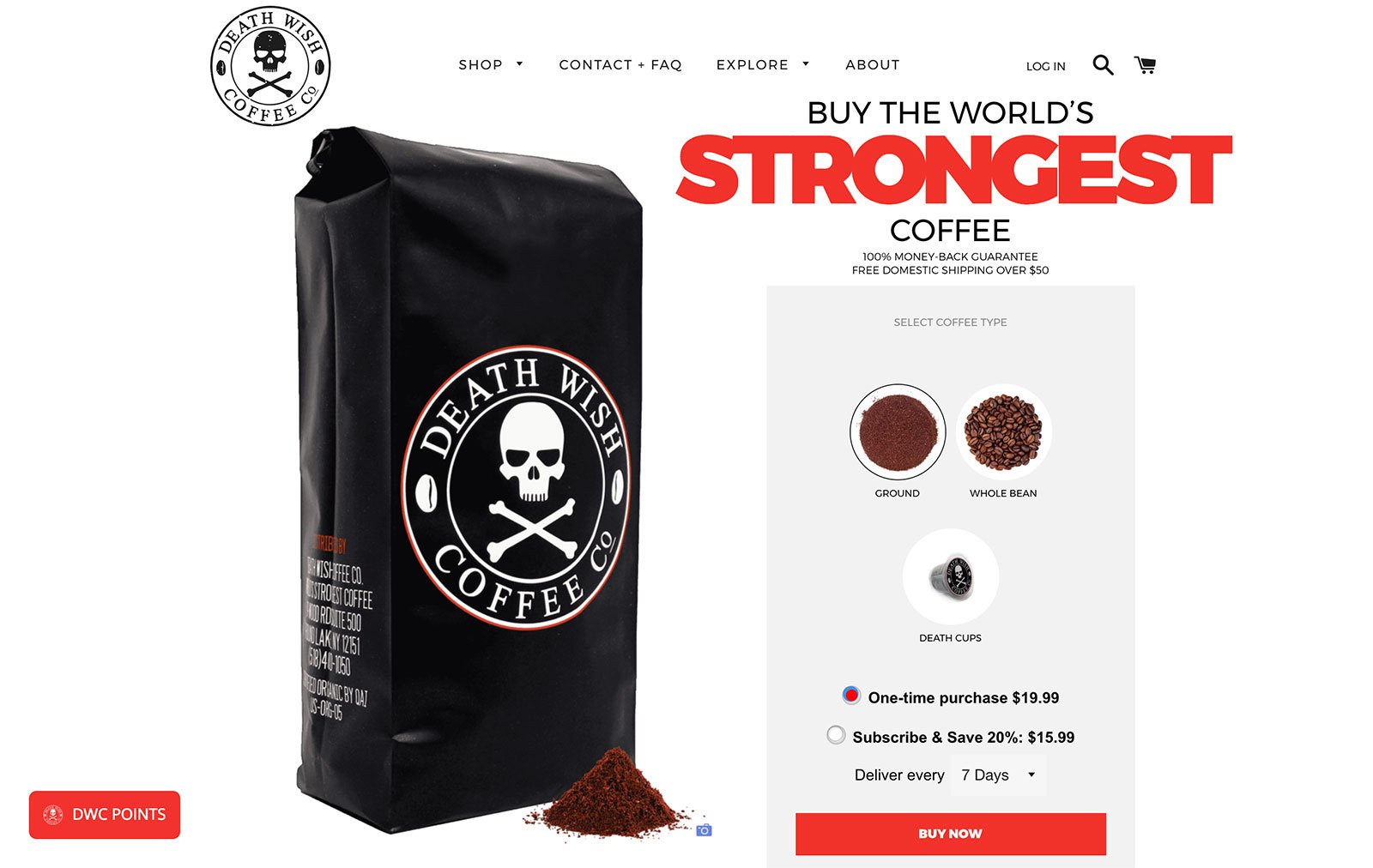
The website for Death Wish Coffee Co. embodies the company’s spirit.
The website claims that their brand of coffee is the strongest in the world due to its unique blend and roasting technique, while also being smooth to taste.
The web design is robust and uses colours like red, large bold letters, and imagery that is consistent with the brand name and logo.
Due to the product being one of the focal points of the entire business, the homepage opens to a large image of it with an option to buy/subscribe to it.
There is no lag in getting to the product page, which makes this a very “in-your-face” approach, but it suits the brand very much and definitely works for them.
Additionally, the black, white & red color scheme is classic and complements the product packaging theme as well.
5. IKKA DUKKA
[image source: A Better Lemonade Stand]
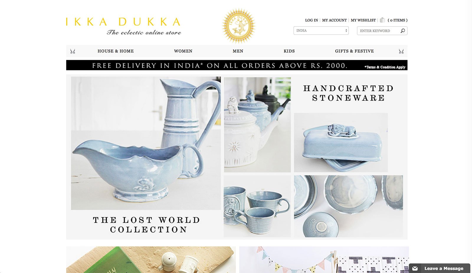
Ikka Dukka’s website isn’t as fancy as many other websites on this list, however, the reason it still belongs here is due to it’s superb product photography.
Be it for a stand alone product or a collection, the images truly make the entire aesthetic appeal of the website.
It’s a standard ecommerce website by all other means, but the photos spin all the magic.
6. JOHN DALIA
[image source: A Better Lemonade Stand]
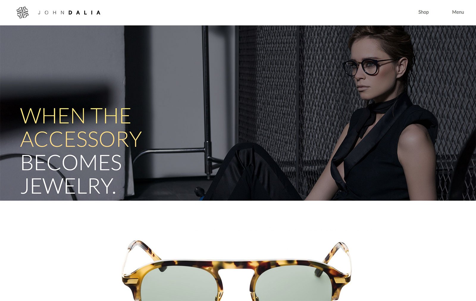
A high fashion brand that is worn by celebrities, John Dalia’s website is nothing less that highly fashionable either.
The homepage opens to a lifestyle shot of the model wearing the luxury eyewear, but when the user scrolls down, they are greeted with an interesting mix of backgrounds and foregrounds, as information and images are layered over each other.
This ecommerce website presents an innovative way of showcasing the products by themselves while also giving featuring them in context.
7. L.NOVUM
[image source: A Better Lemonade Stand]
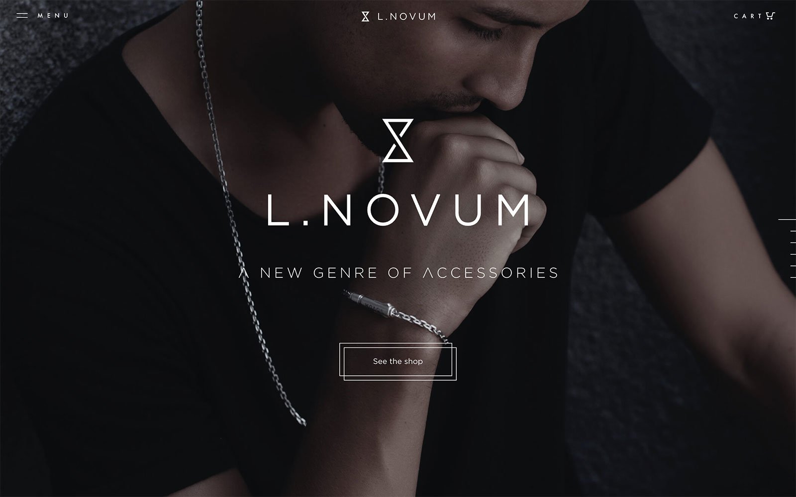
This company describes their products as being meticulously crafted, and their website is no different.
Their products cater to men and so does the theme of their website – dark colors, primarily black and grey, carefully curated and selected product pictures, some great motion and graphics – all add to the persona of the website and the identity of the brand.
The linear navigation brings a new full screen image or large text on screen while scrolling, thus maintaining focus on small chunks of information that are easy to absorb.
Another great example of a well built HTML5 site, using the advantage of multimedia integrations.
8. NAPPA DORI
[image source: A Better Lemonade Stand]
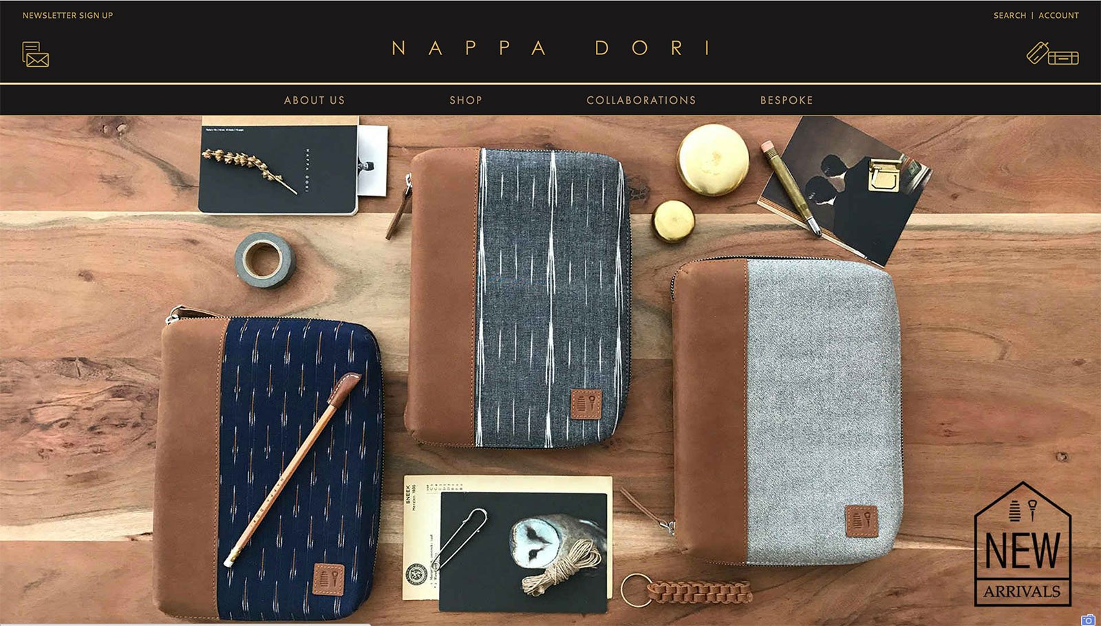
Nappa Dori brands themselves as a “tribute to the quintessential Indian sensibilities” which is blended perfectly with contemporary interpretations in design.
Their website reflects the mysticism and romance of the vibrant culture the brand is inspired by.
The beautiful products are portrayed through stunning visual imagery that highlights the craftsmanship and eclectic modernism.
The eCommerce website incorporates many different aspects such as collaborations, social media integrations and the various collections on sale. A beautifully designed website for the modern romantic.
9. SOAP CO.
[image source: A Better Lemonade Stand]
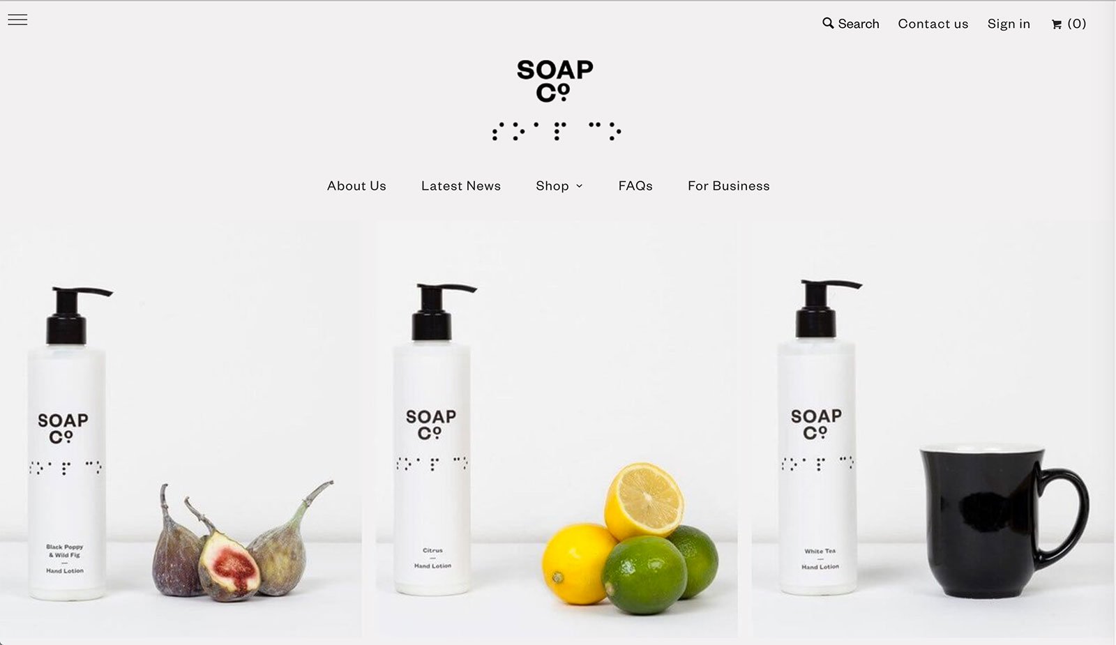
Soap Co.’s ecommerce website opens up to individual images of the products that look like one large photograph of the them beautifully placed on a table alongside their key ingredients.
The theme of the website has been designed to merge beautifully with their product packaging.
The design has a luxurious feel to it and integrates colour beautifully into the landing pages, on the otherwise monochrome theme.
10. TANGLE TEEZER
[image source: A Better Lemonade Stand]
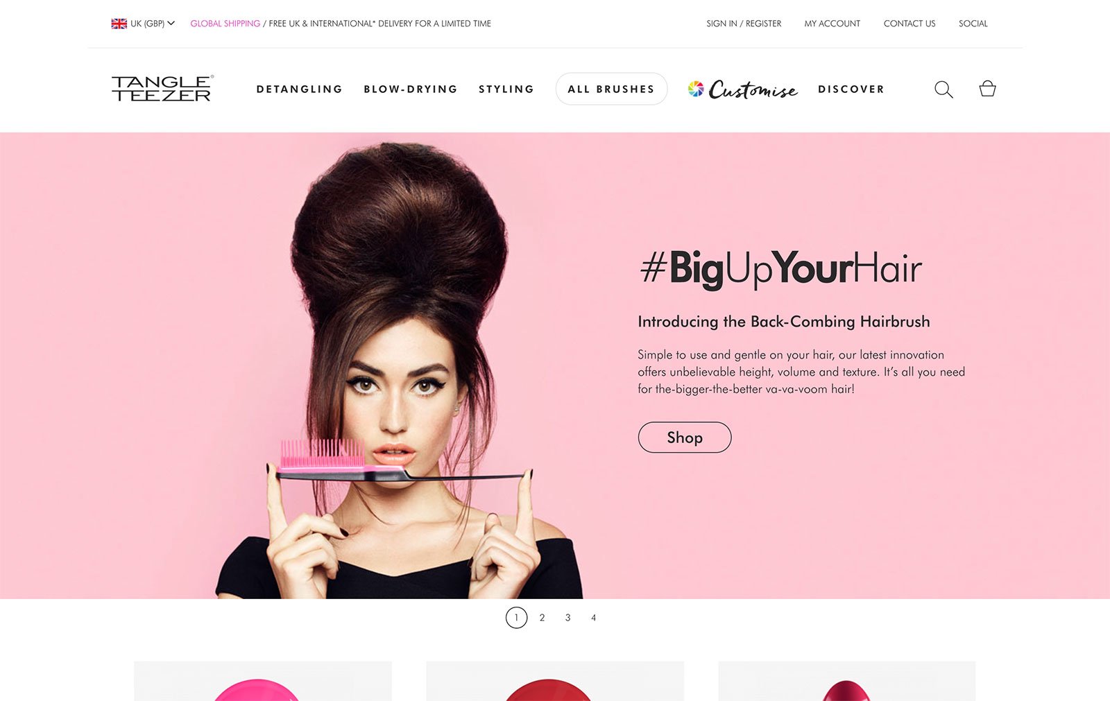
Tangle Teezer’s website is uniquely British: The design, the colours, the models and of course even the products.
The web design incorporates pops of color, banners and geometric cut outs to bring out the wild personality of the brand effectively.
You can check out forty more gorgeous yet functional web design ideas in the full post from A Better Lemonade Stand.


