 As a new online business that is just starting to set up a site online, having compelling call-to-actions (CTA) in the form of a button or link on a website is imperative. Correctly implementing a CTA will guide a visitor and help them understand which steps to take next. In inbound marketing, a CTA typically leads a potential customer to a landing page where a visitor can fill out a form and subscribe to join an email list or learn more (which makes them a lead). Business owners can place a CTA anywhere on their website, but it’s vital to make sure it happens! It’s an integral part of a site and can entice new visitors to become customers hopefully. We discuss why techniques like this during our free webinar training which you should check out! Keep in mind while creating CTAs that they need to grab the attention of visitors and get them to the next step. It’s vital to show potential customers an office they can’t refuse. Below are several CTA examples that should help point you in the right direction as you begin to set up your online business.
Hubspot discusses some incredible CTAs below and even provides visual examples. For starters, read over Netflix’s CTA and decide what you think works well and why. There are so many well-known brands that really know how to identify with their audience. You can do the same!
Netflix
CTA Button: Join Free for a Month
One big fear users have before committing to sign up for something? That it'll be a pain to cancel their subscription if they end up not liking it. Netflix nips that fear in the bud with the “Cancel anytime” copy right above the “Join Free for a Month” CTA. I'd venture a guess that reassurance alone has boosted signups. Also, you'll notice again that the red color of the primary and secondary CTAs here match Netflix's logo color.
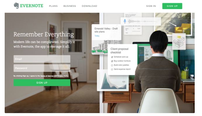
Evernote
CTA Button: Sign Up
“Remember Everything.” Visitors can immediately understand that message the moment they land on this page. The design on Evernote's website makes it super simple for users to see quick benefits of using the app and how to actually sign up to use it. Plus, the green color of the main and secondary CTA buttons is the same green as the headline and the Evernote logo, all of which jump off the page.
OfficeVibe
CTA Button: Subscribe
Here's a slide-in call-to-action that caught my attention from OfficeVibe. While scrolling through a post on their blog, a banner slid in from the bottom of the page with a call-to-action to subscribe to their blog. The best part? The copy on the slide-in told me I'd be getting tips about how to become a better manager — and the post it appeared on was a post about how to become a better manager. In other words, the offer was something I was already interested in.
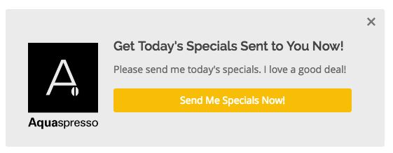
Aquaspresso
CTA Phrase: ‘Send Me Specials Now!'
The whole point of a call-to-action is to direct your site visitors to a desired course of action — and the best CTAs do so in a way that's helpful to their visitors. The folks at coffee company Aquaspresso really nailed that balance here with the pop-up CTA on their main blog page.
Here, the desired course of action is for their blog readers to check out what they're actually selling (and hopefully buy from them). There are many ways they could have done this, including putting out a CTA that urges people to “Check out our most popular products!” or something very direct. But we love what they've done instead: Their CTA offers blog readers something much more helpful and subtle — an offer for “today's specials” in exchange for the reader's email address.
Adding that the specials are for today only is a great example of a psychological tactic called scarcity, which causes us to assign more value to things we think are scarce. The fear that today's specials are better than tomorrow's might make people want to fill it out and claim their offer while they can.
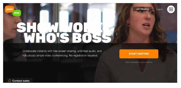
Impact also outlines additional ways to make your CTA stand out. They use Join.Me’s CTA as an example, and if you read it below it’s pretty compelling! You should have the same goal in mind, which is to make an irresistible CTA that no one can resist.
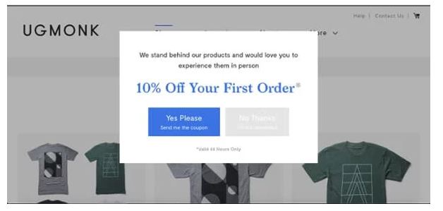
Ugmonk features an exit-intent popup as the user goes to leave the site. This is usually a company's last chance to get you to stay and make that purchase, so it better be a compelling offer! In this example, Ugmonk gives you the option for a 10% off coupon that’s only valid for a certain amount of time really creating that sense of urgency.
Another unique aspect of this CTA is the making the user actively choose “Yes” or “No.” By giving the visitor the option to say no it forces them to think twice as to whether or not they really want to let this deal go. Obviously, Ugmonk wants you to choose the “Yes” option and they show this with the blue color association in the text and the “Yes Please” button.
Join.Me makes it easy for you to immediately start using their product with their button text. Nothing is worse than being at working and waiting what seems like hours for a meeting to start. Join.Me’s text understands this pain, making the idea of starting the meeting right now that much more enticing. Paired with the bright orange color and this CTA is built to be highly effective.
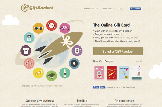
Not only is GiftRocket’s CTA clever, but it’s also visually pleasing to the eyes! Wordstream goes on to explain why else this brand’s CTA works well. Check it out below:
GiftRocket – ‘Send a GiftRocket’
Let’s face it – gift certificates and off-the-shelf greetings cards are pretty much the laziest ways to show someone you care. However, GiftRocket manages to combine the two into a surprisingly compelling package that can actually result in a decent gift for the people you love.Why this call to action works
This CTA is so effective because it doesn’t ask you to “Sign Up Now” or “Get Yours Free,” but allows you to “Send a GiftRocket,” a much more interesting and exciting way to send a gift.
This landing page features simple yet striking imagery combined with short sentences and active verbs, resulting in a compelling experience. Why send a gift card when you can Send a GiftRocket?
Last but not least, ThriveHive discusses various CTA examples that may or may not work well for your site and audience. If you’re not sure what will work best, you can always implement split testing (which means experimenting with different CTAs) to test the waters. Depending on the results of different CTAs, you should have a clear winner that’ll show you which type of CTAs work the best with your audience. Below are some examples from ThriveHive:
View Our Featured Work
This type of CTA is good for businesses that have a portfolio of their work, such as interior designers, photographers, and renovators. Asking website visitors to “check out some of our latest and greatest work” shows your pride in your business and gets them excited about what you have to offer.Booking CTAs
If your business operates on appointments, such as with hair salons, nail salons, massages, and physical therapy, put a “book appointment” CTA on your homepage.
Book Appointment
Amaci salon surrounds their CTA with brief but complete description of their services, and then adds a touch of urgency with “book your appointment online today.”Social Sharing CTAs
Other CTAs to have on your small business website are social sharing buttons—especially on your business blog. Here are a few different ways to encourage your website visitors to spread the word.
Get SocialKeep in Touch
Ways to Connect
Love [business name]? Click “LIKE”!
Blog Subscribe CTAs
Your business blog is a great way to get found on Google and build trust with customers. Having a blog subscribe CTA is also a great lead generation tactic on your website. Here’s a great CTA example by The Educator’s Spin On It. “Never miss a post!” adds some urgency to the messaging, and “Confirm you are human” puts a clever and transparent spin on the typical spam filter.
To make sure a call-to-action results in a lead or new customer, always keep the buyer’s journey in the back of your mind. If the CTA does not fulfill a visitor's need, they’ll likely not proceed with a purchase or read an article further, for example. We help you figure out how to make your site prosper and learn about other techniques to apply so you can develop and maintain a profitable online business. Check out some tips during our free webinar training!
Sources: Hubspot, Impact, Wordstream, ThriveHive
[adrotate group=”5″]
[adrotate group=”6″]
CHALLENGE Yourself to Profit!
Free Download: Build Your Profit-Generating Online Business With This Free Blueprint
Sign Up, follow the easy steps and You'll get the tactics, strategies & techniques needed to create your online profit stream. It's free!

