As video content increasingly rivals text-based articles and blog posts in its importance as a medium, brands in just about every niche and industry are publishing regularly to Youtube.
If you're starting a new business — whether it's a full time thing or a side hustle — one of the first things you might want to want to do is to create your Youtube account and channel.
Part of this is to “claim your name” on various online platforms, but you can also take advantage of Youtube's staggering global popularity to reach more potential customers than ever before.
But, before you start filming and uploading awesome videos, there are a few things you need to take care of first.
You wouldn't start a blog without at least picking a custom theme, right?
The same goes for Youtube.
You need to customize your channel first.
In a recent, comprehensive guide to Youtube marketing, AdEspresso explains the four key steps to optimizing a brand new Youtube account.
How to Optimize Your YouTube Channel
I firmly believe that every business should optimize their channel before they even post the first video.
If you already have your channel up and running, though, it’s never too late to make some edits.
Each of the following subsections will take you step by step on how to do exactly this.
YouTube Channel Art: Choose Wisely
There will be two images that you choose.
The first will be your account’s picture, which will work similar to Facebook’s profile pictures.
The second will be your channel art, which will be displayed at the top of your channel much like Facebook’s cover photo.
You need to choose these images wisely, as they’ll be one of the first things that users notice about your brand.
In the example below, my account picture is the picture of me, and the flowers are my channel art (please note, this is only an example account).
[image source: AdEspresso]
I recommend that your account picture (which you set through your Google account) is some sort of brand logo.
If you’re a one-person business, it can be a professional headshot of you.
Ideally, it should match your profile pictures on other social media accounts for instant brand recognition.
This works both ways; if ones of your followers from another site comes across your YouTube, you want them to recognize you so they’re more likely to watch.
And, vice versa, if a viewer Googles you, you want them to be sure that the Facebook profile they’re clicking on is actually you.
To change your channel art, just click on it when editing your profile.
[image source: AdEspresso]
For channel art, choose something that represents your business while being visually dynamic.
I highly recommend using graphic design tool Snappa to create your YouTube channel art.
They have pre-made templates that are sized to fit your channel perfectly, all of which are fully customizable.
Try to use similar colors, fonts, and stylistic choices that you make on your website and profile picture.
You can also add text to help get your point or brand across more quickly. A great example is AdEspresso’s own channel art:
[image source: AdEspresso]
Add Links & Contact Info to Your Profile
The goal of YouTube marketing should be to send users to other social channels, or to your site (or both).
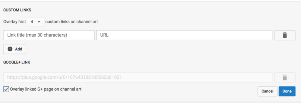
Make it easy by adding links to your channel.
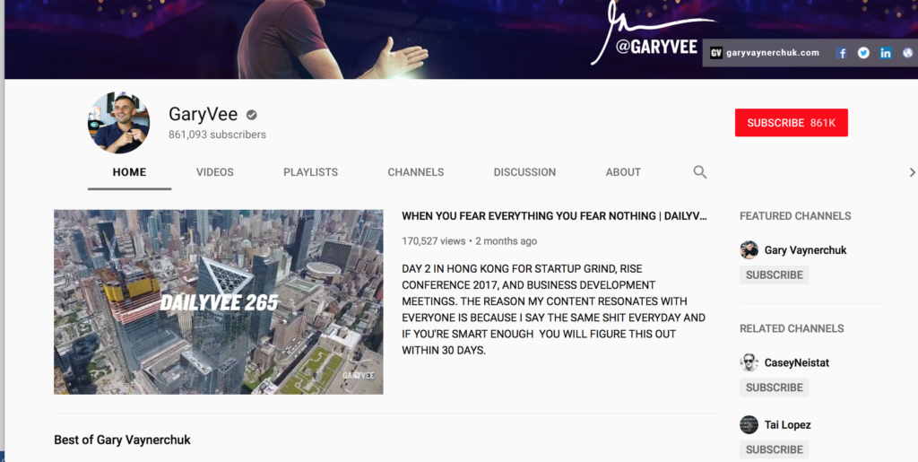
They’ll appear in the bottom right-hand corner of your channel art, in a place that’s easy to see and highly clickable.
[image source: AdEspresso]
To do this, click on the edit pen in the top right hand corner of your channel art while editing your profile.
Select “Edit links.”
[image source: AdEspresso]
On the next screen, one of the first things you’ll see is the ability to add an email for users to contact you on.
Do this. The easier it is for a customer to contact you, the better.
[image source: AdEspresso]
Below this, you’ll see the option to add up to 5 custom links. I’d add your main site to be listed first, then Facebook.
Then, in the order they’re most important to your business, any of the following 5 options:
Twitter, Instagram, Pinterest, and/or LinkedIn.
[image source: AdEspresso]
Add a YouTube Channel Description
This is one a lot of businesses forget about, and trust me- you don’t want to.
A well-written YouTube channel description helps you demonstrate why users want to watch your content and subscribe to your channels.
It gives you a chance to give them the background of your business in a way you might not be able to do efficiently in a featured video.
Your channel description should explain what your business is, and what you can offer users on your YouTube channel.
You can add a channel description in the same place you add the email address and links in the above section.
[image source: AdEspresso]
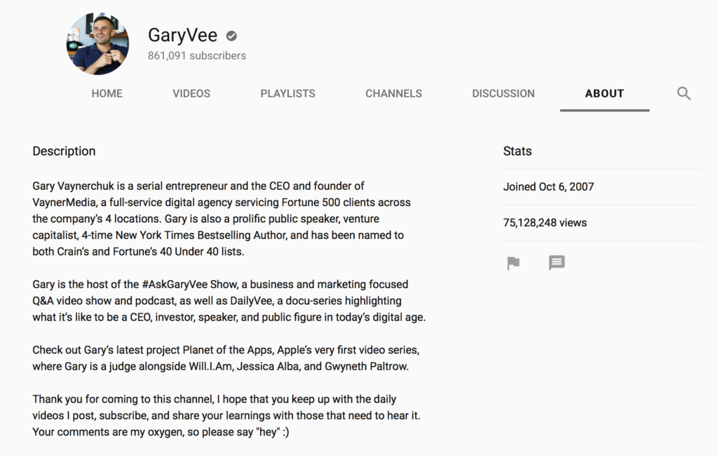
If you’re looking for an example, Gary Vaynerchuck’s description is golden:
[image source: AdEspresso]
Create/Add a Featured Video
All channels should absolutely, 100% have a featured video.
This video will be placed prominently in the top and near-center of your channel.
When users click to it, it will auto-play, catching their attention immediately.
This lets you choose how you want to introduce yourself to your viewers.
This is particularly important, because the description of your business doesn’t appear on your first page.
[image source: AdEspresso]
Again, use this video to introduce customers to what you do and how your channel specifically will benefit them.
A great example if Salesforce’s featured video:
When you’re editing your profile, you’ll see the option “For Returning Subscribers.”
If you click on this, you’ll see the option to add featured content. This is how you add the featured video.
Do the same for “new users,” and upload the video as a channel trailer.
You can find more great advice for setting up a Youtube channel for your brand in the full guide from AdEspresso.
CHALLENGE Yourself to Profit!
Free Download: Build Your Profit-Generating Online Business With This Free Blueprint
Sign Up, follow the easy steps and You'll get the tactics, strategies & techniques needed to create your online profit stream. It's free!


