 Creating a website, putting together a landing page and figuring out the best way to get traffic gets challenging at times. Sometimes after checking the analytics and seeing nothing, it’s easy to wonder why the conversions aren’t taking place. In our free webinar training, we discuss not only how to make an online business succeed, but tactics to implement to boost landing page conversions. In this article, we review a few of those tactics you can apply starting now. We’re happy to guide you to conversion-rate bliss.
Remove Distractions
Getting rid of distractions on your website can help increase conversion rates. If the goal is to keep your landing pages minimalistic, then viewers will be more likely to click on the right thing, which is your call-to-action button, as Entrepreneur suggests.
Removing links (such as your site's navigation) increases conversion rates. Obviously, you'll still include your logo to build your brand's recognition and link that element to your home page. But make no mistake: The goal is to strip your landing pages down to the bare minimum. That means giving up the sidebar, too. The more options you give viewers, the more competition you give your call-to-action button.
Clear CTA
We talked about removing distractions, and the reason why it’s so important is that you want your audience to find your Calls to Action (CTA) easily. Here are some trips from Report Garden on how to do that:
One of the most important elements of a landing page is the Calls to Action (CTA). While they might seem to be just a button, these are the best way to get the users take desired actions. When placing CTAs here is what one should keep in mind:
Color – CTA button should be contrasting in color to the background used. Use attractive colors like orange, green and blue, such colors never fail in grabbing the eyeballs of the users.
Size – The size of the CTA button should not be too small that it becomes illegible for the users. Also, it should not be too huge to scare them off. The ideal size would be the one which perfectly syncs with the landing page layout.
Message – Inculcate a sense of urgency/need in the offering, this helps in improving the conversion rate.
Talk About Product Benefits
What are the benefits of your product? Why should customers buy what you’re selling? These are the sort of things you should think of when putting together your landing page. The more attractive your landing page is, the more likely you’ll get sales or at least interested buyers. Let’s see what else Forbes has to say:
When writing about your offer, make sure you emphasize the benefits of it, rather than just describing it blankly. As a simple example, you might say that your vehicle “helps users get to their destinations” rather than saying it’s “capable of traveling great distances.” This simple change in perspective helps users understand how the product fits into their lives and personalizes your messaging.
Improve Your Page’s Content
How’s your page’s content? BuffGuyMedia says it has everything to do with how well your site succeeds and whether you’ll get people’s attention. There’s always room for improvement, so if you feel you can improve your content you should work doing that stat!
A landing page’s success is 50% content and 50% where your traffic is coming from. For example, when a person opts to join your mailing list, they expect to get something from reading your emails. Nobody is going to dive into your other page details if what you have offered initially is not enticing. For better conversions, your landing page copy must be convincing and to the point. It doesn’t matter how pretty your landing page appears, users are not going to convert if the content is not genuine or very convincing. Adding a FAQs section is an excellent move as the questions users might have before signing up can be addressed and clarified.
Persuasive Subheads
Persuasive subheadings support a killer headline, and together they can lead to a powerful landing page, as Crazy Egg reveals:
The next element you need to create an effective landing page is the subheadline.
If the headline makes the visitor look, then the subheadline should make them stay. Together, these pieces of copy make up the one-two punch of a landing page’s power.
Here’s what to keep in mind as you create yours:
Normally, the persuasive subheadline is positioned directly underneath the main headline.
The subheadline should have some element of persuasiveness.
The subheadline can go into slightly more depth and detail than the main headline.
Show Images That Offer Cues
If you show images on your site that point potential customers in the right direction, then you’re more likely to get clicks on your page. See what else the Content Marketing Institute has to say about effectively using this technique to point readers to where you want them to click or learn more about a product or content.
Point visitors in the right direction – nudge them to act. Visual cues – implicit and explicit – can indicate where visitors should direct their gaze.
An implicit directional cue could be a picture of a person looking in the direction of your CTA button. An explicit directional cue could be an arrow pointing directly at your CTA. Let’s go into each type in more detail.
Use implicit cues
The principle behind visual cues is what Malcolm Gladwell calls “microexpressions” – small facial indications or “fleeting looks” that we recognize in other people that impact how we interpret emotions.
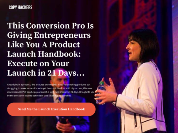
Eye-tracking studies have found that facial features are the first thing people look at when they see someone new. When visitors see a picture of someone looking favorably at a product or form, there’s a better chance they will respond positively.Facial cues can be subtle. Look at this landing page on Copy Hackers:
The image is positioned so copywriting expert Joanna Wiebe faces the text and her hands are close to the CTA. Without directly pointing at the button, the image guides visitors’ eyes toward where they need to click.
An effective implicit visual cue will make clicking seem like the natural next step.
Use explicit directional cues
Implicit visual cues are subtle, while explicit cues are not. Arrows and illustrations unabashedly point to the CTA.
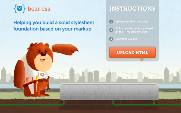
Take, for example, Bear CSS’s cute landing page:
The bear points visitors toward the CTA button.
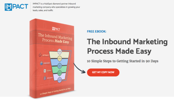
If something quirky wouldn’t work for your brand, a simple arrow is also effective. IMPACT’s e-book landing page is a great example:
The arrow is animated to pop up after the page loads – another visual trigger to attract the visitors’ attention to the call to action.
Learn From Others
Entrepreneur reminds us how important it is to learn from others. Sometimes observing how others do it can help us learn about what we’re doing incorrectly and what we can improve.
There's no shame in basing your landing page on a style you've seen somewhere else. If you're drawing inspiration from a company that's significantly larger than yours, its marketing department almost certainly has invested time and money to develop and test the strategies you see.
Leverage their knowledge to your advantage, but don't simply copy their designs. Note which components and tactics are at work. Then, refer to the points above to analyze what makes their pages so inviting. Once you know why a landing page works, you can replicate that success without lifting someone else's design or identity.
Other Tactics
Here are a few other tactics you might want to try. Report Garden gives you a lot to think about so you can easily improve your landing page and in the process hopefully make more money!
Well, the above- mentioned list isn’t a comprehensive one; here are other tactics which have also proved out to be worth in landing page optimization.
Include Testimonials – These have a powerful impact on the prospects. Testimonials act like immediate reviews, hence always include multiple testimonials from past customers.
Include Contact Information – This helps to prove that a business is legitimate. Always include a phone number, e-mail address and the times when support is available.
Limit Navigation – Don’t distract users by allowing them to navigate. Limit their exits from the landing page so that they are focused more on filling out the form.
Shorten The Lead Form – Shorter lead forms increase the likelihood of the customer filling the form.
Social Proof – This strategy creates a positive influence on the prospects as they get to know that others are doing something. Social proof can be a powerful addition to the marketing strategy.
Testing – Landing pages should always employ testing and improvement. The landing page creation tool should allow creating and testing different landing pages to know which one is working best for a business.
Join us during our next free webinar training to learn additional ways on how to make your online business and landing page succeed.
Sources: Content Marketing Institute, Entrepreneur, Crazy Egg, Forbes, BuffGuyMedia, Report Garden
CHALLENGE Yourself to Profit!
Free Download: Build Your Profit-Generating Online Business With This Free Blueprint
Sign Up, follow the easy steps and You'll get the tactics, strategies & techniques needed to create your online profit stream. It's free!


