Short on ideas for great Facebook ads for an eCommerce business?
The great thing about Facebook advertising is that their targeting options are super flexible.
You can find all kinds of ways to segment your audience and deliver the right messages to the right people at the right time.
Some of these options are pretty straightforward and commonly used.
Many ecommerce companies target ads to people who abandoned their shopping cart, for example.
Those are pretty prime leads, after all. They not only visited your site, but they got as far as choosing the products they wanted to buy.
Who knows why they left? Life happens.
Bringing them back is often pretty simple.
But that's far from the only option for ecommerce Facebook ad targeting.
In a recent article, Social Media Examiner offers a bunch of cool ideas you can try, some of which are kind of off the beaten path.
Increase Product Trials
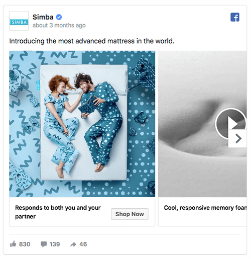
In this ad, UK mattress company Simba uses the carousel ad format with short, feature-rich videos and a single image to market its hybrid mattress.
The single-sentence copy is used to grab the target audience’s attention by piquing their curiosity. Also, the brevity pushes the target audience to consume the carousel cards that highlight the product features.
Attention-grabbing video, particularly in the first carousel card, is another excellent feature of this ad. The short, looping videos make the ad more immersive and engaging than regular images. Finally, the use of a single image in the second-to-last carousel card breaks the expectation of another video and effectively draws attention to the 100-day trial offer.
As people look through the carousel, each carousel card title is used to highlight either a consumer benefit or a product feature. The card text is concise so it isn’t cut off in a mobile news feed. The Shop Now CTA reinforces the desired trial mindset.
Remarket to Potential First-Time Buyers
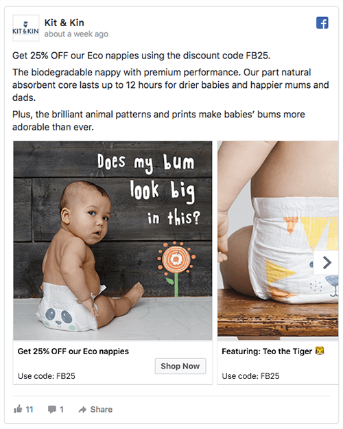
Eco-baby brand Kit & Kin uses a retargeting ad that features a carousel of images and promotes a 25% discount on their eco nappies to encourage a first purchase.
The ad copy is used to emphasize the benefit to the target audience. The first line is written to clarify that this ad offers a promotion, specifically a 25% discount deal. The first line also clearly states the discount code that someone needs to use to take advantage of the offer.
The rest of the copy is included to keep the focus on benefits. After stating a product feature, the copy describes how the feature benefits the buyer: “drier babies for happier mums and dads.” The final line of copy highlights another product feature, the print on the nappies and the aesthetic benefit to the buyer.
The carousel images don’t show the product on its own because that would be boring. Instead, the product images show the target audience what the nappies look like when babies wear them.
Notice how the first carousel title reminds the target audience that they can get 25% off. The cards that follow highlight the animals printed on the product and relevant emojis make the text stand out even more. The Shop Now CTA reminds the user that they’re in a buying mindset and will receive a discount.
Present Use Cases
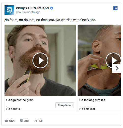
This great ad from Philips uses both video content and the carousel ad format. Each video demonstrates a use case of their new OneBlade razor.
In a video carousel ad, Philips presents several use cases for its product.
[image source: Social Media Examiner]
The ad copy is short and sweet. The two-sentence copy precisely hits the benefits of using the product. The copy is quick to read, just as the razor makes shaving quick and easy. The ad copy piques the readers’ interest so they watch the videos in the carousel.
Below the ad copy, in each use case video, the audience sees a different demonstration that illustrates the product’s flexibility. Also, in each video, the carousel title and description use a clever approach. Each title talks about a product action, such as “Go against the grain.” The carousel description follows with a benefit, such as “No doubts.”
The carousel descriptions also reinforce the benefits in the main ad copy. After the ad copy and carousel make a strong case for buying the product, the Shop Now CTA takes people to the product page to make a purchase.
Final Thoughts
In an effective Facebook ad, the copy, visuals, and CTA need to present a compelling message. In your ad copy, don’t just list features; identify how your product benefits customers. For visuals, take advantage of video’s popularity and higher rates of engagement to minimize your ad spend. And make sure the ad copy and visuals build to your CTA.
When your three ad elements work together to present a consistent and compelling message, your Facebook ad has a good chance of having the desired impact on your target audience.
For more fresh Facebook ad ideas, check out the full post at Social Media Examiner.
CHALLENGE Yourself to Profit!
Free Download: Build Your Profit-Generating Online Business With This Free Blueprint
Sign Up, follow the easy steps and You'll get the tactics, strategies & techniques needed to create your online profit stream. It's free!


