Your business's Facebook page isn't just for cultivating brand awareness.
You can also use your organic social media presence to drive sales directly.
When it comes to Facebook marketing, most of the focus is usually on their paid advertising platform.
But your page itself is also something you can optimize to drive sales, and that shouldn't be overlooked.
The way to do this is to have a strong, sales-oriented CTA button. It should be eye-catching and compelling.
Facebook offers a bunch of options, which you can select by editing your page.
They range from “book now,” to “get in touch,” and you can choose one that makes sense for your product or service. From food delivery to B2B services and SaaS companies, businesses of any kind can get a lot of mileage out of Facebook's CTA button options.
In a recent blog post, Social Media Examiner explains how to choose the perfect CTA button on Facebook.
Select a Sales-Oriented CTA Button
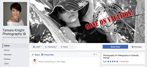
Your page’s Call to Action (CTA) button sets the stage for the main action you want users to carry out. Do you want them to shop your products or call you to book an appointment? Choose the best CTA button for your business.
[image source: Social Media Examiner]
Choosing the right CTA button for your Facebook page will increase the likelihood that users move closer to converting and purchasing.
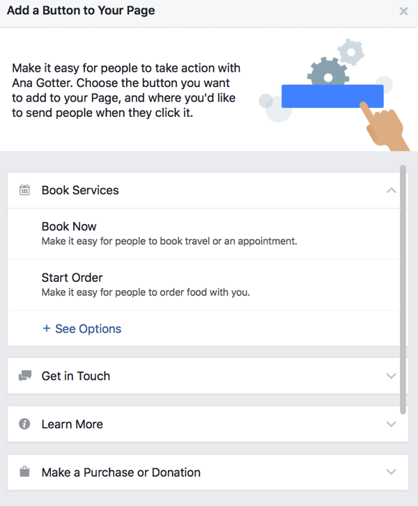
To change your CTA button, click it on your page. You’ll then see a ton of different options you can choose from.
[image source: Social Media Examiner]
You can choose from a large number of CTA buttons for your Facebook page.
While you likely know which CTA to choose for your business, here are some general guidelines:
1. Select Book Services if your services are fairly straightforward and you want to optimize for appointments.
2. Choose from the Get in Touch options if your business can reliably and quickly answer on Facebook, and the best way to win over customers is one-on-one communication. Great examples of businesses that would find this option useful include boutique fitness studios, freelancers, and consultants.
3. Choose Shop Now if (like Book Services) your business sells products that can be bought fairly quickly and without needing a lot of questions answered first.
[image source: Social Media Examiner]
Add the Shop Now button to your Facebook page to make it easy for users to buy from you.
4. Opt for Start Order or other customized food delivery CTAs if you’re a restaurant looking to optimize for takeout or delivery orders.
5. Pick a Learn More option if your products or services are complex, high-priced, or unfamiliar to users. They’ll be more likely to click Learn More than Sign Up if they’re unfamiliar with your business or product; it’s a lower-pressure option.
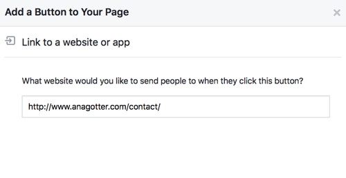
After you decide on your CTA, you’ll need to set it up. For Contact Us, as an illustration, enter a specific Contact Me page through which users can send you emails.
[image source: Social Media Examiner]
Finish setting up your Facebook CTA button with links or contact information so it’s fully functional.
You can find out about more ways to optimize your Facebook page for product sales over at Social Media Examiner.
CHALLENGE Yourself to Profit!
Free Download: Build Your Profit-Generating Online Business With This Free Blueprint
Sign Up, follow the easy steps and You'll get the tactics, strategies & techniques needed to create your online profit stream. It's free!

