Unless you've been living under a rock, you've probably heard of Shopify.
They're one of the top platforms right now for creating elegant, responsive ecommerce sites — without having to write even a single line of code.
Over the past year, they've acquired 55% more paying customers than before, and their revenue is estimated at nearly $400 million.
Along with having a fantastic product, Shopify's success can also be attributed to their content marketing efforts.
They're on a roll lately, and their blog is one of the best online resources for learning about ecommerce, especially dropshipping.
They've got an impressively sophisticated sales funnel in place, too.
And one of its key elements is the creation and promotion of webinars.
They've done a great job steering their blog audience toward signing up for said webinars, using a multi step process to maximize turnout.
In a recent blog post, Wishpond explains exactly how the webinars fit into their strategy.
1. Including an In-Article Webinar Prompt
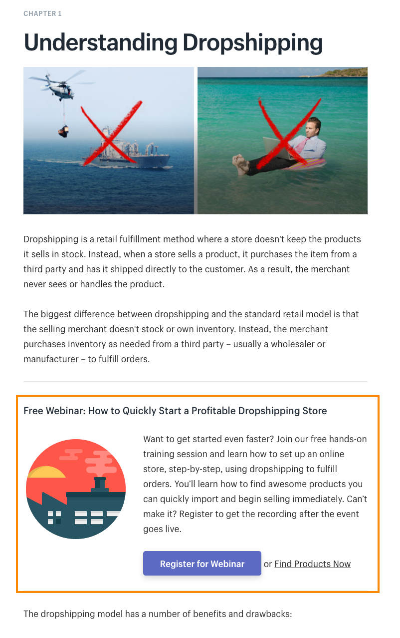
As I really dive into Shopify's Guide to Dropshipping, I see something interesting at the top of each Chapter: a prompt for me to “Join our free, hands-on training session” – a webinar.
[image source: Wishpond]
If you're going to prompt any kind of conversion, be sure you get as many eyes on it as possible by putting it at the top of your post.
2. Directing Visitors Toward Conversion with a Webinar Landing Page (With Countdown Timer and Click Popup)
It makes sense that Shopify is sending people to a separate landing page for their webinar (as opposed to the content upgrade in Strategy #2) because there's far more information which needs to be communicated. And that can't be done within a click popup.
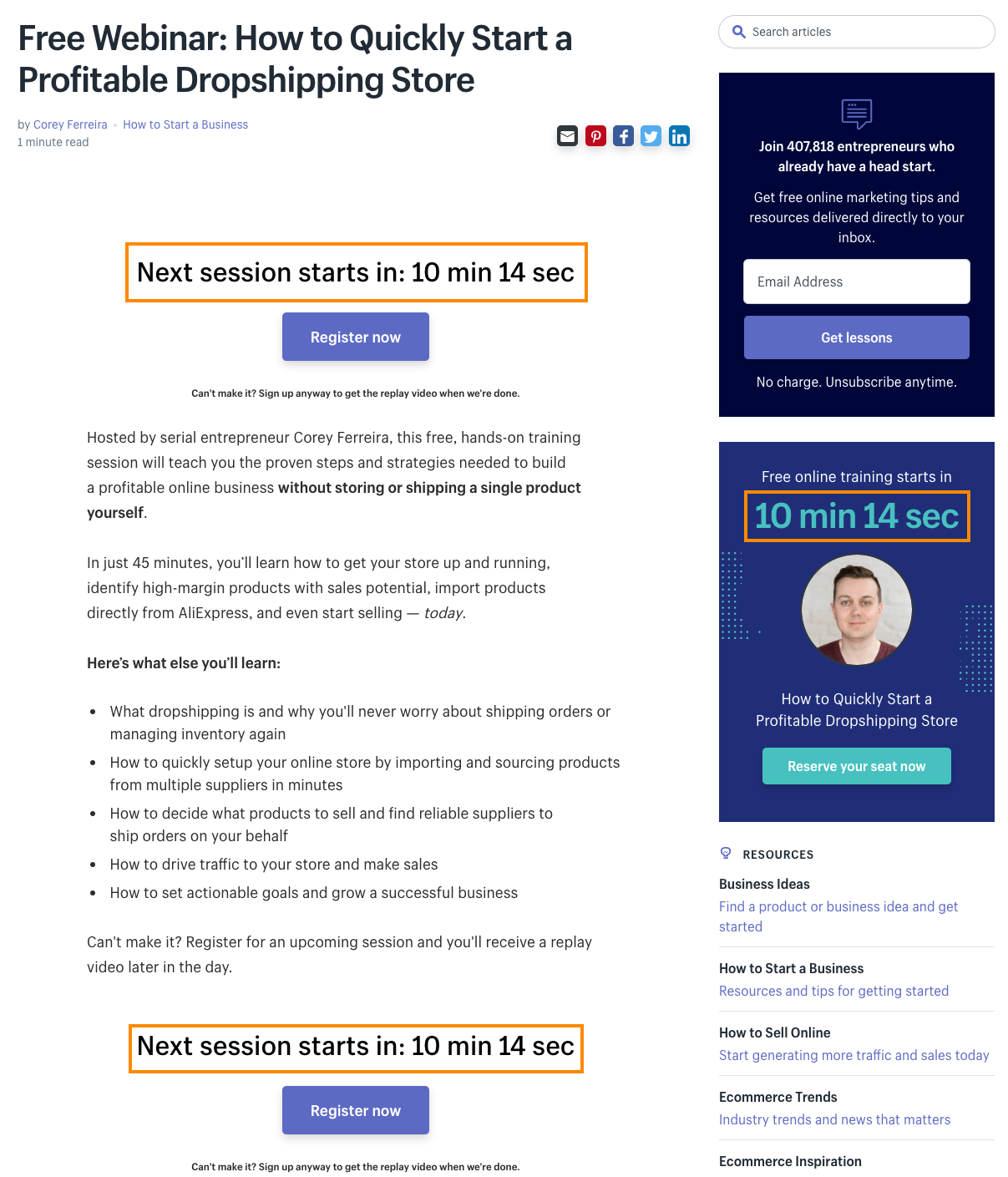
Let's take a look at the page:
[image source: Wishpond]
Breaking down this webinar Landing Page:
- Headline: Obvious and to the point, the headline is at the top of the page and promptly features the word “free” (never a bad idea.
- CTAs:This page has three different CTAs, all of which open the click popup I'll show you below. Multiple CTAs (so long as they're for the same objective) increase the opportunity for conversion.
- Formatting: Short paragraphs and the bullet-points ensure visitors aren't overwhelmed by too much information, too quickly.
- Countdown Timer: Countdown timers have been shown to increase conversion rates on landing pages by up to 300%. They create urgency, and communicate to visitors that, in order to get value, they need to convert now.
- “Can't Make It” Copy: This is an important part of the page, reminding traffic (three times) that they can get the replay video even without attending – a crucial component to increase the chance of people converting, especially with a webinar coming up in 10 minutes.
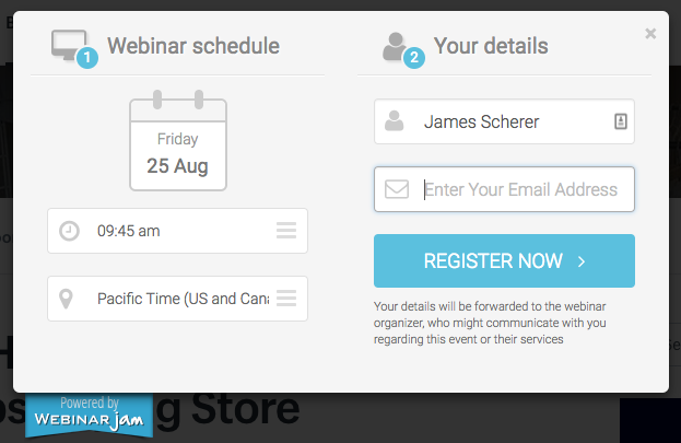
Clicking any of the three CTA buttons opens a click popup with two choices of times, your timezone, and a name and email address form:
[image source: Wishpond]
3. Optimized Webinar Registration Page with Video (Includes the Script)
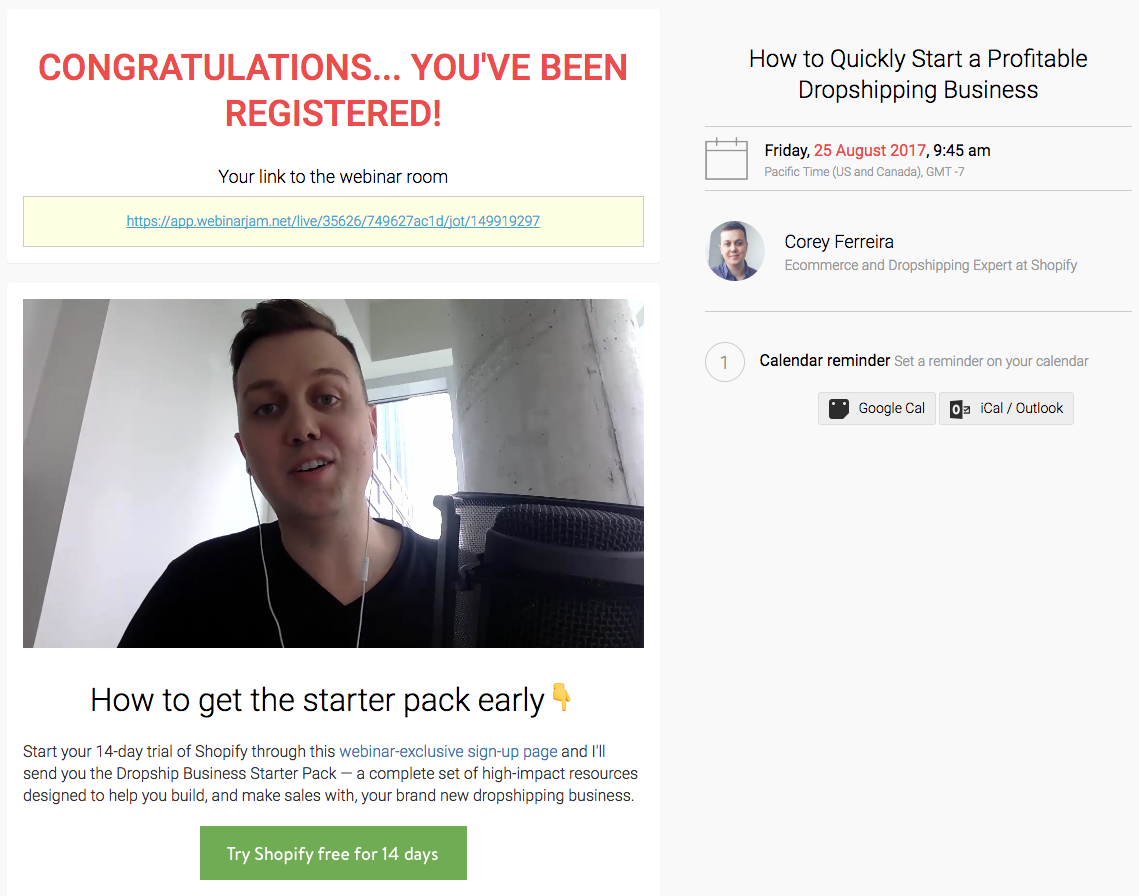
Converting on the webinar registration form sends you through to the “Congratulations” page. This page features the host, Corey Ferreira, prominently, and is focused on getting registrants to attend live:
[image source: Wishpond]
ACTIONABLE TAKEAWAY
The focus of your webinar's post-registration page (or “Thank You” page) is to increase webinar attendance. Create a video which repeats the need for people to attend live in order to get the full value.
4. Sending Webinar Autoresponder Emails to Improve Attendance
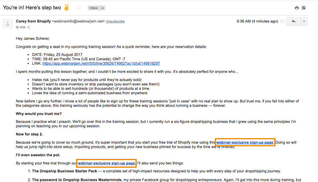
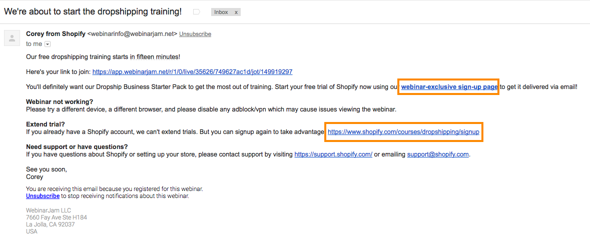
In the ten minutes or so before my webinar with Shopify starts, I receive two emails from Corey. Let's dive into what they look like, and what their objectives are…
Email #1: “You're in! Here's step two”
[image source: Wishpond]
Email #2: “We're about to start the dropshipping training!”
[image source: Wishpond]
ACTIONABLE TAKEAWAY
Trigger your webinar's reminder emails as soon as someone registers and then again 10 or 15-minutes before you start rolling. In these emails, provide an incentive for people to start a free trial or complete some other conversion objective –
Remembering that those objectives need to have a direct connection with getting the full value from the webinar.
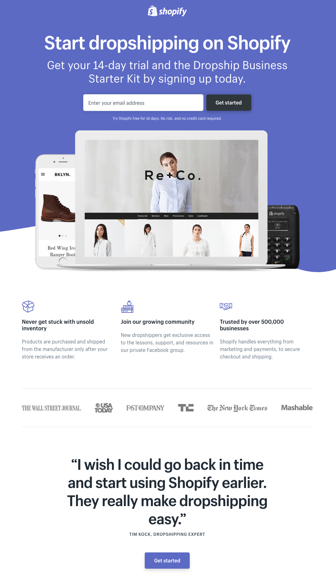
5. Creating a Webinar-specific Landing Page
Clicking any of the four free trial links sent in those two emails sends registrants to a webinar-specific landing page.
The dropshipping, webinar-specific landing page:
[image source: Wishpond]
ACTIONABLE TAKEAWAY
As much as you possibly can, personalize the experience of your website visitors throughout the sales funnel.
They should never just “start a free trial,” but rather “start a free trial to start dropshipping,” or “start a free trial to start selling your jewelry/Etsy products/hair extensions/organically-grown diapers” (whatever).
Personalization = optimization.
You can find more suggestions for boosting your webinar signup rates over at Wishpond.
CHALLENGE Yourself to Profit!
Free Download: Build Your Profit-Generating Online Business With This Free Blueprint
Sign Up, follow the easy steps and You'll get the tactics, strategies & techniques needed to create your online profit stream. It's free!

