Facebook's world-class advertising tools make it simple to build an ad completely from scratch.
But sometimes, too many options can be overwhelming instead of helpful.
Where do you even begin?
One way to approach this is to use a trial and error process, uncovering what works and what doesn't by trying different options and seeing what performs the best.
But that's kind of costly and time consuming.
An easier way is to use ad designs and formats that are already proven to work for your products or your target audience.
Proven, time-tested Facebook ad templates can give you a much needed head start on reaching your audience, at every stage of the buying process.
From just getting word out about your brand's existence, to bringing back repeat customers who've shopped with you before…
A recent blog post from AdEspresso offers a bunch of awesome templates that are practically guaranteed to get the results you're hoping for.
Here are four of the best.
Establish Brand Awareness
You’ve developed pitch-perfect branding for everything that represents your business, which goes beyond just a logo and a color scheme.
That’s where you can turn to video, the perfect medium to hype your business.
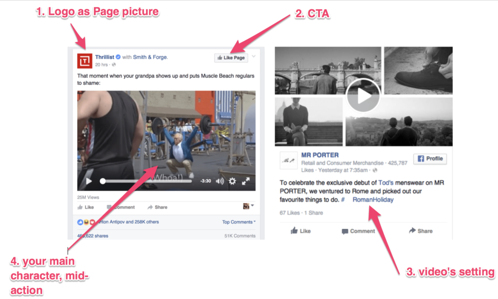
For video ads, the first thing users see is the thumbnail.
The trick to getting people to watch is to feature a main character mid-action.
Having a really clear main character in your video thumbnail is a great way to get people to watch the rest of your story.
The thumbnail makes people ask “why”.
The copy should tell people where the story takes place, as the text is where people will look to for more context around the thumbnail.
[image source: AdEspresso]
Drive Traffic to Your Site
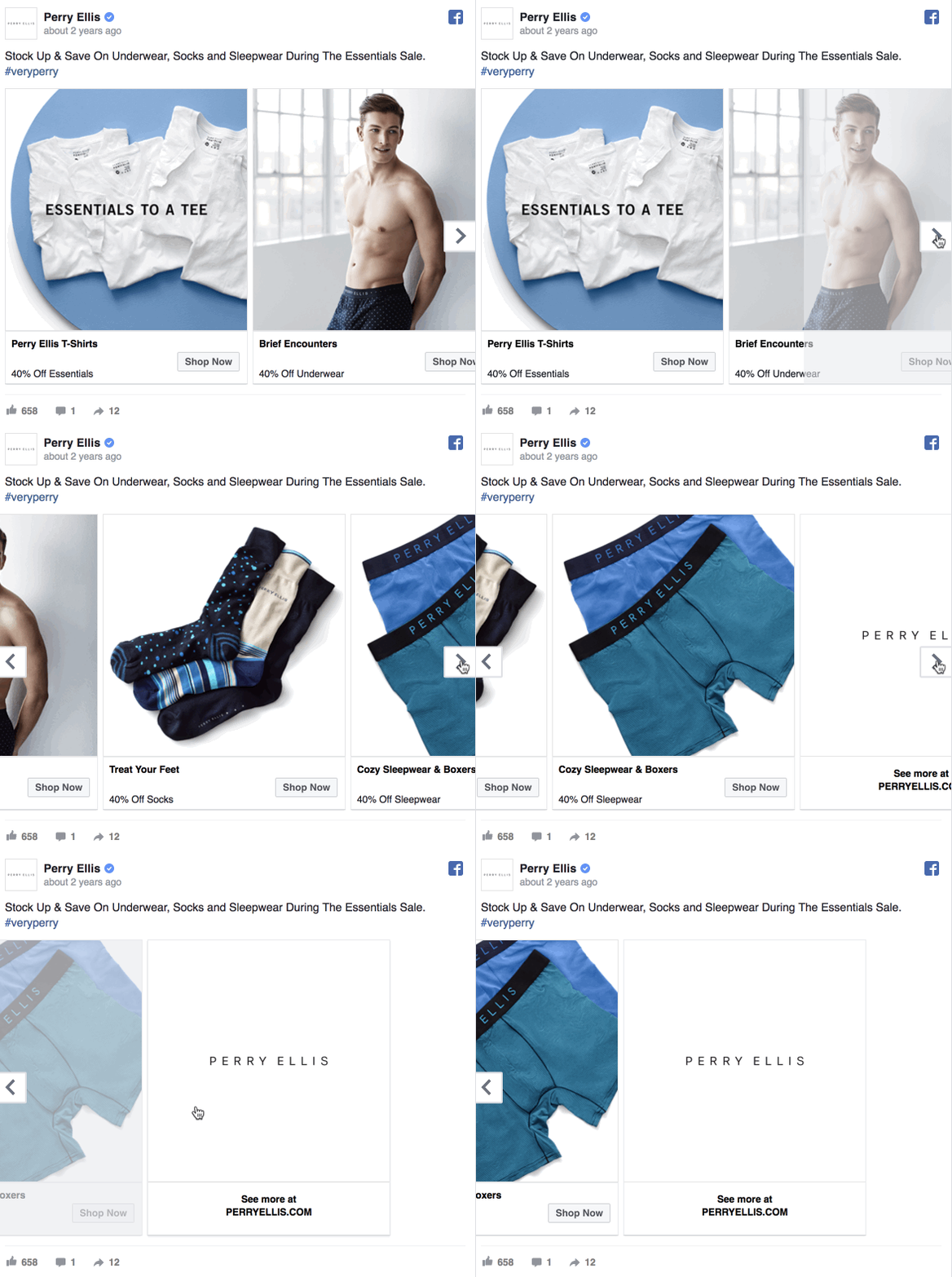
Facebook carousel ads are the perfect way to drive site traffic.
Each carousel lets you use up to 10 pictures in the space of a single ad—meaning more room to show off what your site offers.
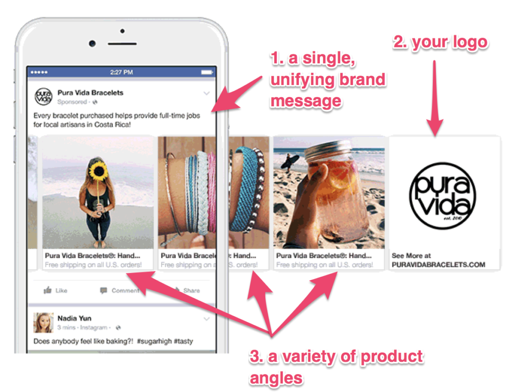
The best way to use this space is to showcase your product from multiple perspectives.
Variety is a top reason people are compelled to shop at one store over another.
Some customers might want to simply purchase the product—include your product against a simple background.
Others might be drawn in by a model—feature your product in-use.
Others still might just love the lifestyle your brand helps create—put your product within an aesthetic context.
For all the variety, it’s important for people to come away with a sense of your website as a whole.
To instill unity in your ad, be sure to include a brand message that unifies the photos, as well as a business logo at the end of your Carousel.
[image source: AdEspresso]
Boost Conversions
The best way to boost conversions is to tailor your ad to an audience that has shown interest in your product before—whether it’s a prior sale or click.
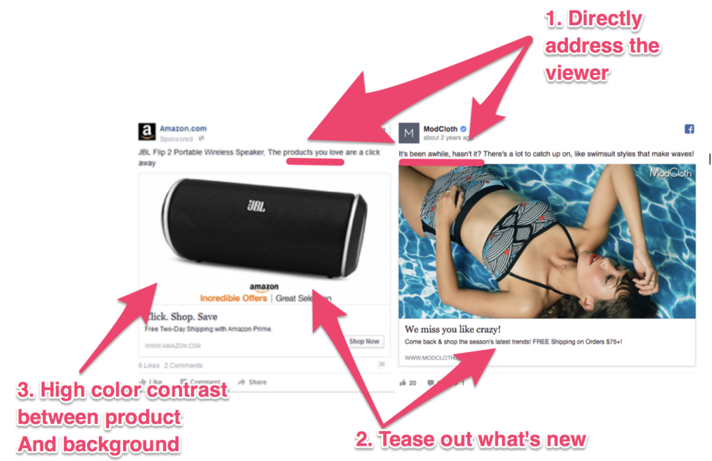
Your ad copy should show what’s new about your business, to keep your customer’s impression of your business as up-to-date and evolving alongside them.
You can do this by featuring a product that’s in-season (different from what your customer was looking at in their last visit) or new on the site.
Play up your prior connection by addressing the customer directly.
A single-image ad that features your product will do the trick; just be sure to find the right color contrast to bring out whatever item you’re featuring.
[image source: AdEspresso]
And that's just the beginning. You can find twelve more proven templates in the full article from AdEspresso.
CHALLENGE Yourself to Profit!
Free Download: Build Your Profit-Generating Online Business With This Free Blueprint
Sign Up, follow the easy steps and You'll get the tactics, strategies & techniques needed to create your online profit stream. It's free!


