Paid traffic through Google or Facebook is a great way to drive traffic to your site.
But once you've convinced your readers to click on the link, where exactly are you sending them?
If it's your homepage, we've got some bad news.
It's a fairly common rookie mistake to send paid ad traffic to your website's homepage.
That might seem logical on the surface, but the thing is, homepages are about as loosely targeted as it gets these days.
It's not somewhere that visitors stay for long. It's more of a central hub for the rest of your actual content.
It might have general information about your brand and your products…
But it's not designed for conversions.
Because of this, if you send someone to your homepage, they're not likely to convert.
When you're paying for traffic, that's a problem. Fortunately, it's an easy fix.
You need a carefully crafted landing page instead, something designed specifically to motivate people to take action.
In a recent blog post, Kissmetrics gives a full rundown on why “Dwight” sending paid traffic to his homepage is a waste of his advertising budget.
I know what some of you are thinking:
Our homepage has the product on it. By sending traffic there, we’re making visitors product-aware.
Plus, it’s littered with information about our value proposition.
And THAT will move them into the most-aware stage. It’s the ultimate landing page.
Bazinga.
Fair point.
But, remember the ultimate goal is conversion.
Convincing Dwight that Hawaii is the best place to be, doesn’t mean he’s booked the ticket. Getting to the final stage of awareness is still only awareness — not action.
And although visitors are “landing” on it, I’ll say this again:
A homepage is not a landing page.
Homepages are the gateway to the rest of your site. They are for visitors at every stage of awareness. This makes writing homepage copy a bit of a doozy.
But, landing pages are purpose-built conversion-machines. They follow an optimized set of design principles. Squeezing out every sign-up, opt-in and sale possible. They do this by adhering to a staple of conversion copywriting:
The Rule of One.
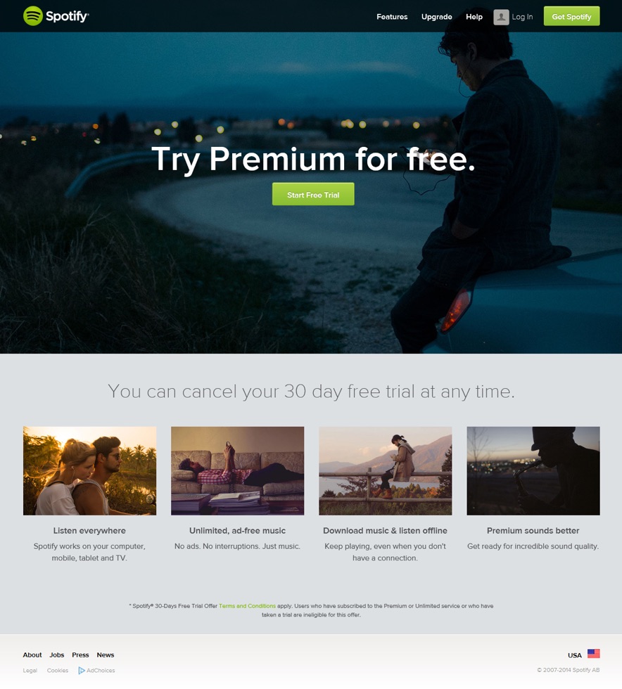
The Rule of One is to design each page with one reader and one big idea in mind. For example, Spotify’s landing page for a product-aware prospect (one-reader) with a free trial offer (one big idea):
[image source: Kissmetrics]
No more, no less.The purpose of the Rule of One is to convert. It gives a single visitor a single path.
This is why homepages are troublesome for copywriters. A homepage is for everybody, and so, it converts nobody. Sure, you may have a CTA above the fold, smack-dab in the center. But, how many conversions do you get compared to a purpose-built landing page?
A lot less, I’d assume.
Targeted, focused, and relevant landing pages are the key to high conversions.
One company found their ad-specific landing pages outperformed their generic pages by 115%. And companies have seen a 55% increase in leads when increasing their number of landing pages from 10 to 15.
This is the beauty of directing paid traffic to landing pages. You can create them based on exactly what the visitor needs to see at their stage of awareness.
Homepages are static — There can be only one.
The Bottom Line
If you’re directing paid traffic to your homepage — you’re wasting your marketing budget.
Your homepage was never meant to be more than a central hub. A starting point. Whereas landing pages have every single element designed, tested and optimized for conversion.
You are paying money for this traffic.
If you currently have ads directed to your homepage, direct them to a relevant landing page.
Go, now.
You can learn more about homepage design, landing pages, and more at Kissmetrics.
CHALLENGE Yourself to Profit!
Free Download: Build Your Profit-Generating Online Business With This Free Blueprint
Sign Up, follow the easy steps and You'll get the tactics, strategies & techniques needed to create your online profit stream. It's free!


