 Companies use Call-to-action (CTA) buttons on their website and landing pages. CTAs are used to guide visitors and customers to click so that they’ll take a specific action you want them to take. CTA buttons come in a variety of sizes and styles depending on the website design and a company’s goal conversion. While setting up a new business, as we discuss in our free webinar training, it’s essential to develop a responsive website with compelling CTAs. A few examples of call-to-action buttons are below. We also include some additional ideas on how to get potential customers to click. And no, it’s not by saying ‘Click Here.’
Download buttons
Free trial buttons to sign up
Add to cart now buttons
Crazy Egg discusses a CTA button’s goal, which is to get your web visitor to click on a particular link and in the process hopefully convert. Find out what the psychology is behind CTA phrases and which ones might work best with your audience
What is the Psychology Behind CTA Phrases?
psychology-behind-call-to-action-phrases
From the day we’re born, we’re taught to follow orders. That’s why you might learn that definitive CTA phrases work better than others.
For instance, compare these two call-to-action phrases:
Are You Ready to Subscribe?
Subscribe Now!
Which one catches your attention? The second one. That’s because the phrase proves definitive and authoritative. It tells the reader exactly what to do.
Consumers have also come to expect CTAs. They predate the internet. From billboards and television commercials to brochures and flyers, advertising creative always includes a CTA.
Call this number now to get our low-low price!
Want more information? Call 888.555.5555!
Like what you see? Visit us at the corner of 1st and 2nd Streets!
See what I mean?
On the internet, though, the call-to-action phrases can become far more dynamic. Not only can consumers click them with the mouse or tap them with a finger, but the CTA buttons’ colors, fonts, and other visual elements can influence conversions.
Consumers who are internet-savvy know what a call to action looks like. Consequently, they’ve become psychologically influenced to click.
That doesn’t mean the click’s automatic, though. The specific call-to-action phrases you use and the placement of those CTAs can also have a psychological impact.
If you want a visitor to take the next step, Search Engine Journal recommends having the CTA right before a visitor is ready to take the next step.
The trick to optimizing calls to action is to present the action at the precise moment when your website visitor is most interested in taking the next step.
There has to be compelling content preceding the link, as well as an accurate description of the landing page.
If the landing is a dud, every time you present another opportunity to leave the page, your user may not trust that you are not wasting their valuable time.
Sometimes providing more information about a button will encourage visitors to begin their free trial or take the next step. Let’s see what else Wordstream has to say about incorporating button text, button shapes, and more.
Bonus Button Text. There are some situations in call-to-action marketing where you may want to consider adding an extra line of information within your button text.
This practice is common with free trial buttons. For example, a free trial button might say “30 day trial, no credit card” in smaller text beneath the main “Start Your Free Trial” button text. This is valuable info that will encourage users to click through to begin their trial.
Snazzy Button Shapes. Button shape can also play a big role when attempting to craft the perfect CTA button. You’ll need to consider whether you want to go with a more rounded button shape or a button with square edges. Hard to say what works better here as both style are common and both can perform well in different settings. Ultimately you’ll have to test shapes and see what works best for your biz!
Natural Hierarchy. Sometimes you’ll have other buttons on your web page that are not your main call-to-action conversion buttons. Those buttons should be less attention-grabbing than your main CTA button. For your non-CTA buttons, try using gray scale buttons or monochromatic colors. Your main call-to-action button should always be the biggest and brightest.
Button Text Shouldn’t Go On and On and On. We discussed earlier how it’s good to use specific action-oriented button text. Considering that, it may be tempting to stretch out your button text, but that’d be a bad move. Ideally you’ll want to keep that button text to two or five words.
Another thing to consider when setting up your CTAs is correctly setting up hover responses, as Search Engine Journal tells us. As the site tells us, it’s up to you to make your CTA impossible to miss and prompt visitors to click on the link.
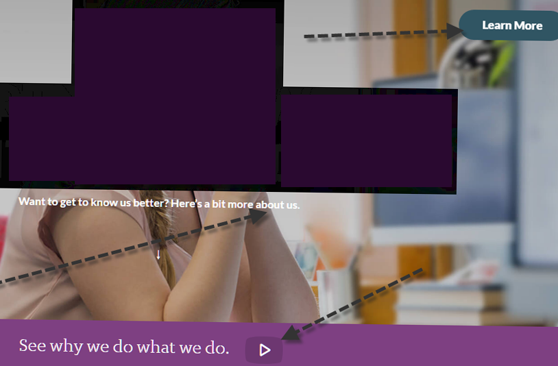
This next example is a mixture of a button, text sentence, and text sentence with a clickable icon overlaying a large header image.
If you were to watch someone during user testing, you would most likely watch them mouse over the button, the text, and the text with the icon to see which one is going to go somewhere they want to go.
We mouse over screens expecting a hover response when links are not obviously links. When there is no mouse, a screen reader is expected to find the links for us.
If a user has no mouse and is using keyboard navigation to tab key through content, links are expected to be outlined and highlighted visually. For touch screen navigation, there is no hover response.
For this example, the “Learn more” button label provides no information about what we are going to learn.
It is the most visible CTA and the eyes of the person in the image are facing the button, which is a designer trick because studies show we look to see what the face is looking at.
How can we optimize the CTA for this page?
First, remove the button to learn more. We are going to give it an upgrade.
The text below the image, in a tiny font size, is not linked. It asks a question, but the user must look for where to get the answer.
It also asks a question that may not be as important or interesting as the one following it. I would remove the entire “Want to get to know us better” sentence.
The more compelling story is why.
The button can be larger and placed in line with the model’s eye gaze. The button label is the invitation to “See why we do what we do” and link that to their story.
Not only does this narrow the choice to one link for one lead task, but it is easier for screen reader software to announce the link and direct visitors listening to the page.
Links with labels such as “learn more”, “read more”, “shop now”, “submit”, “click here”, “download” and “continue” are common.
Don’t be afraid to experiment to optimize calls to action by inviting the action.
Sometimes we may get a little too enthusiastic.
Sumo says you should make your buttons jump off the page! Okay, not literally, but visitors need to be able to notice them when they’re visiting your website. If they can’t easily find them, then it’s unlikely they’ll take the next step.
MAKE YOUR BUTTONS IMPOSSIBLE TO MISS
You could have the best button copy online, the highest converting supporting text, and you could be oozing social proof but if nobody sees your call to action button, that’s all useless.
If you’re trying to create the best call to action button out there, you need to start by making sure it’s seen by your website visitors. Here’s how.
MAKE IT JUMP OFF THE PAGE
Last July, I reviewed over 100 websites for Sumo customers.
The #1 issue I saw on the Welcome Mat, pop-up, and Click Trigger I reviewed was that my eye didn’t immediately go to the call to action button when the tool appeared.
Since we humans have 8 second attention spans, your call to action button should be one of the first things your visitors notice when they land on your page or see your pop-up.[*
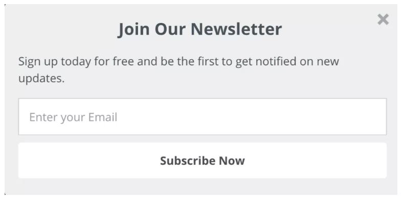
Meaning your button should not look like this:
Instead, make it jump off the page with an action color.
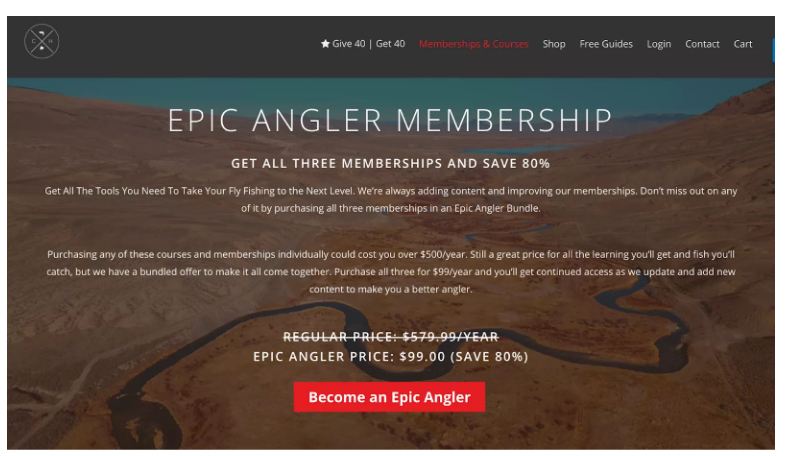
Check out how Sumo customers The Catch and the Hatch does this with their call to action button:
CTAs will help your website take off, which is why you should learn the best ways to help people relate to you and your products. To learn how to set up a site that succeeds, we walk you through how to start a profitable online business during our free webinar training. Register for our next training today!
Sources: Search Engine Journal, Wordstream, Crazy Egg, Sumo
CHALLENGE Yourself to Profit!
Free Download: Build Your Profit-Generating Online Business With This Free Blueprint
Sign Up, follow the easy steps and You'll get the tactics, strategies & techniques needed to create your online profit stream. It's free!


