A/B testing is one of the best ways to get the hard data you need to refine your marketing strategies.
When in doubt, test, test, and test some more.
But don't jump into it just yet. Chances are, you're forgetting something really, really important.
Before you even start, you need one really important thing.
You need a plan.
You need to make sure you've set a clear goal for your test.
You can't just wing it. Proper goal setting is a big part of good methodology.
You need to know what you're testing, why you're testing it, and how the results of the test are going to affect your future strategic decisions.
You can A/B test all kinds of things — headlines, email subject lines, ad copy, logo designs, and more.
But whatever it is that you're testing, you need clear strategic goals.
In a recent blog post from Quicksprout, marketing magnate Neil Patel explains how to set clear, actionable goals for your next A/B test.
Set a clear goal for your testing procedure
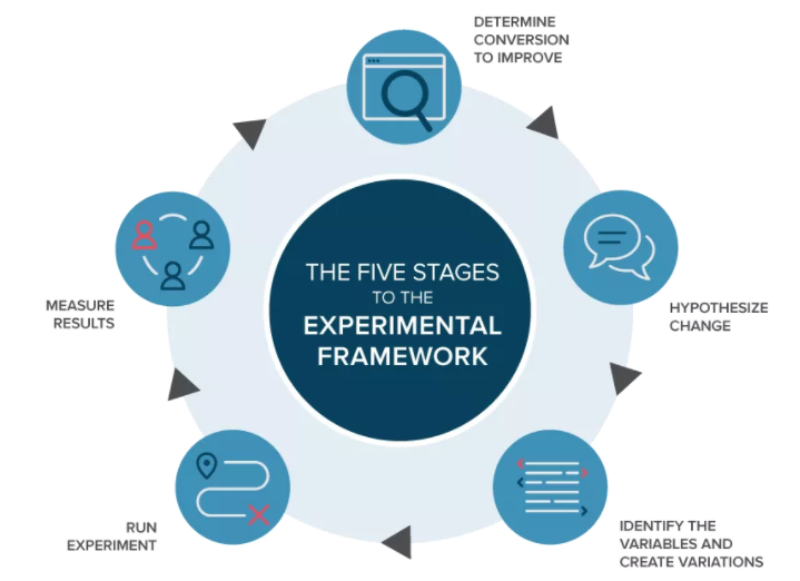
Here’s a visual representation of what your procedure should look like:
[image source: Quicksprout]
The first thing you need to do is determine which conversion to improve.
Don’t change every aspect of your website.
That’s an ineffective approach and won’t give you measurable results.
Instead, make an alteration to something specific that’s related to your goal.
If you’re unsure where to start, here are some examples of different components you can change on your website:
- the headline
- subheadings
- your call-to-action buttons
- links
- text
- awards and mentions in the media
- testimonials and social proof
- images
- videos
- advertisements
These are just some basic suggestions to get you brainstorming.
All these components can affect the behavior and actions of your visitors.
Ultimately, these actions can impact your conversions.
Once you set a goal, you can form a hypothesis to test to determine whether that solution will help you reach those goals.
For example, let’s say your goal is to increase conversions.
Your hypothesis is that increasing the size of your call-to-action button and making it more prominent on your homepage will increase conversion rates.
Then you devise a split test to test that hypothesis.
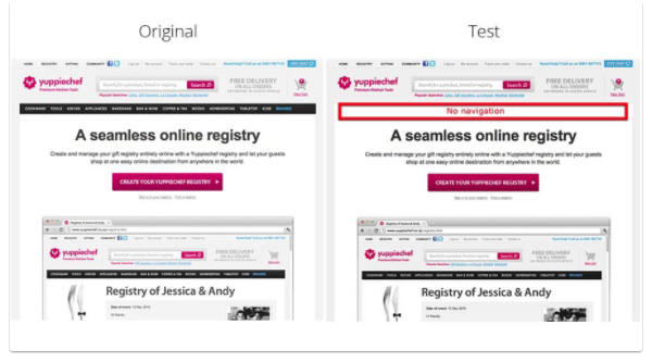
Here’s an example from Yuppiechef:
[image source: Quicksprout]
Yuppiechef hypothesized that their website users were too distracted by their navigation menu.
They thought that visitors had too many options to click, so they weren’t selecting the CTA button.
What did they do?
Yuppiechef removed the navigation bar for their variation page of the A/B test.
The test layout resulted in a 100% increase in their conversions.
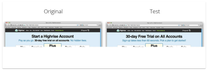
Highrise used A/B testing to test a hypothesis about the header on their homepage:
[image source: Quicksprout]
Altering this heading increased clicks by 30%.
To sum up the process:
- set a goal
- come up with a hypothesis (what elements should I change to try to achieve this goal?)
- run an A/B test
- analyze the results
If you change too many components of your website, it will be extremely difficult to accurately test your hypothesis.
You can find more great advice for effective A/B testing over at Quicksprout.
CHALLENGE Yourself to Profit!
Free Download: Build Your Profit-Generating Online Business With This Free Blueprint
Sign Up, follow the easy steps and You'll get the tactics, strategies & techniques needed to create your online profit stream. It's free!


